Pressures

Explore Weald to Waves, and the pressures affecting nature and people in the corridor.
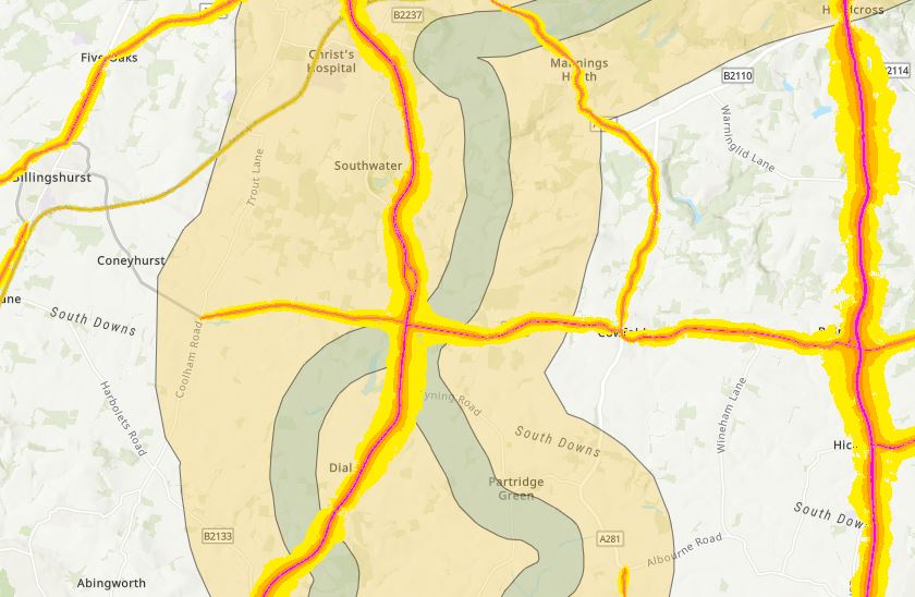
The UK is one of the most nature-depleted countries in the world. A wide range of different pressures are causing this decline with serious consequences for both wildlife and humans. This interactive map contains a series of datasets (layers) to help you explore these pressures on nature and people along the project corridor.
How to use our interactive map:
Viewing Groups: Click the left arrow button on the left of the map screen to show the groups list. The layers in this map are organised by thematic groups, such as nature recovery projects, the corridor boundaries, etc. Use the arrows to the left of each group to view the layers it contains.
Turning on/off layers: Each layer can be made visible, and hidden, by clicking the eye icon beside each layer. Experiment with viewing different layers to explore what these datasets can tell you about the corridor. Caution: layers can become difficult to see, and loading time will increase, when large numbers of layers are turned on try viewing just a few layers at a time for the best experience.
Visibility: if a layer is greyed-out, try zooming in/out to find the best scale to view that dataset. Some layers are best viewed locally, while some are most informative on a national scale.
Finding out more about a layer: clicking any feature on the map will bring up a layer summary box. This contains a description of the dataset and how it relates to the corridor, along with how it was created, and the attribution/licence information. Sometimes several layers are overlaid. Use the arrows in the top right of the layer summary box to switch between information for each layer.
Legend: Click the right arrow button on the right of the map screen to show the map’s legend. This will give descriptions for the colours and symbols used on the map.